

MatriSakhi
MatriSakhi is a maternal health app designed to support expectant mothers, caregivers, and healthcare professionals. The goal was to create a user-friendly experience that simplifies access to vital health resources while ensuring inclusivity.
My role:
I led the UX/UI design for MatriSakhi, including user flows, high-fidelity screens, moodboarding, and logo design, ensuring a simple and culturally relevant experience.

Problem Statement
Complex Navigation: Users struggled to find key features.
Poor Accessibility: Limited support for visually impaired users.
Inconsistent Design: Lack of visual clarity and hierarchy.
Low Engagement: No personalization or interactive elements.
Client’s Request
Simplify the navigation for better usability.
Improve accessibility for a diverse user base.
Create a visually appealing, culturally relevant design.
Introduce personalization to boost engagement.
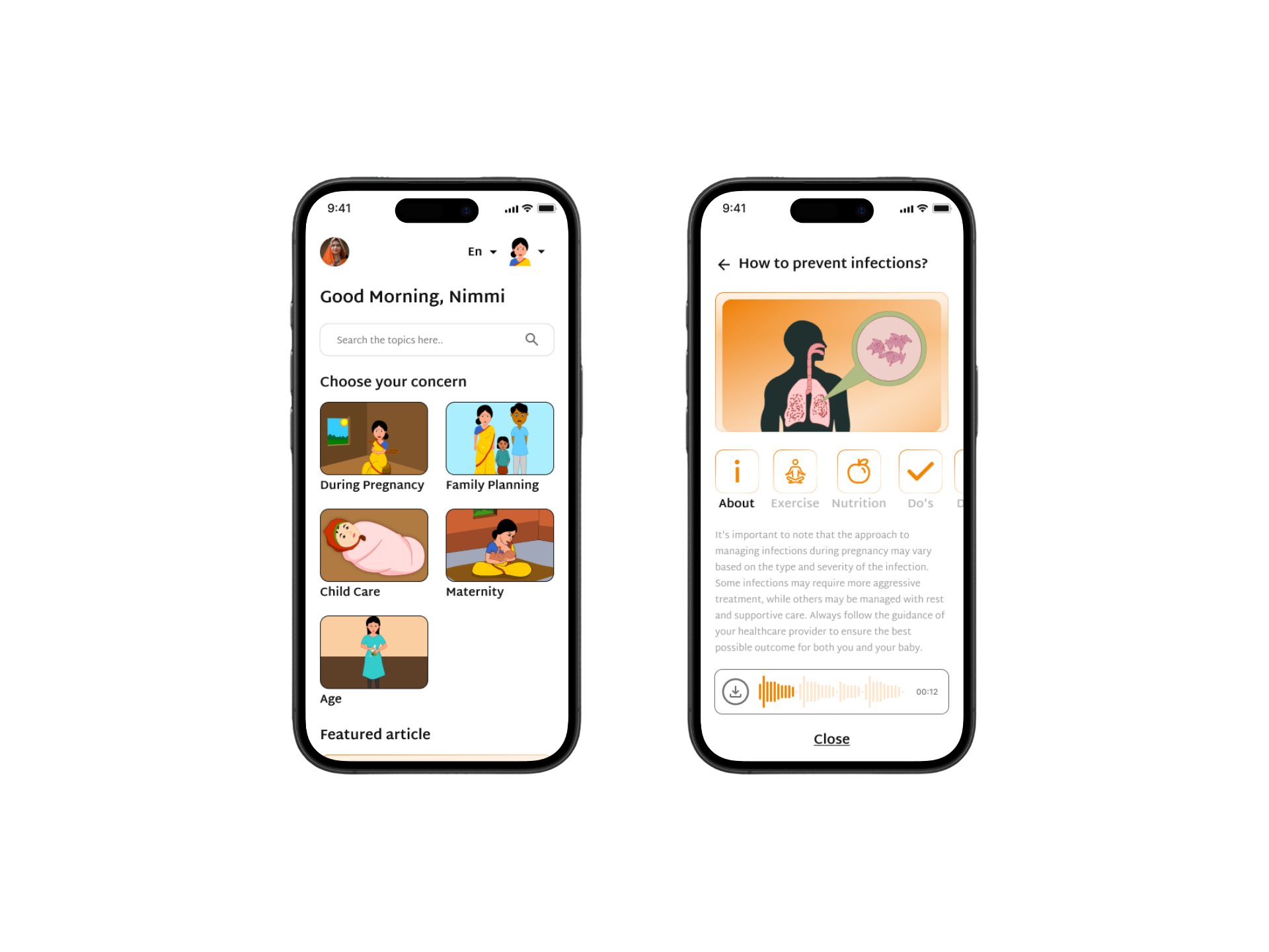
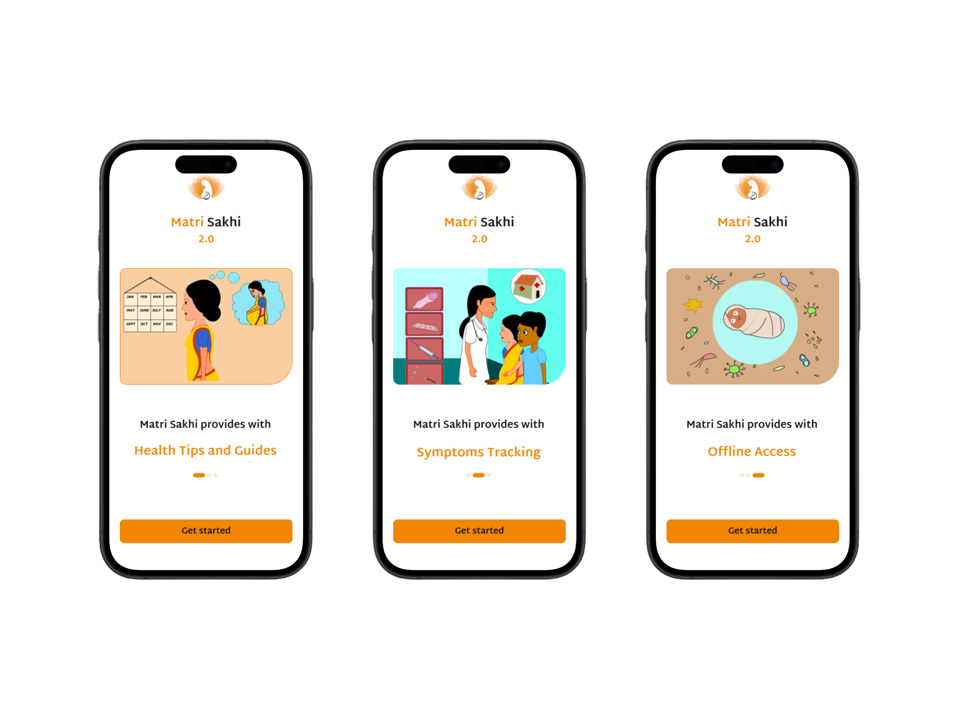
Solution & Key Features
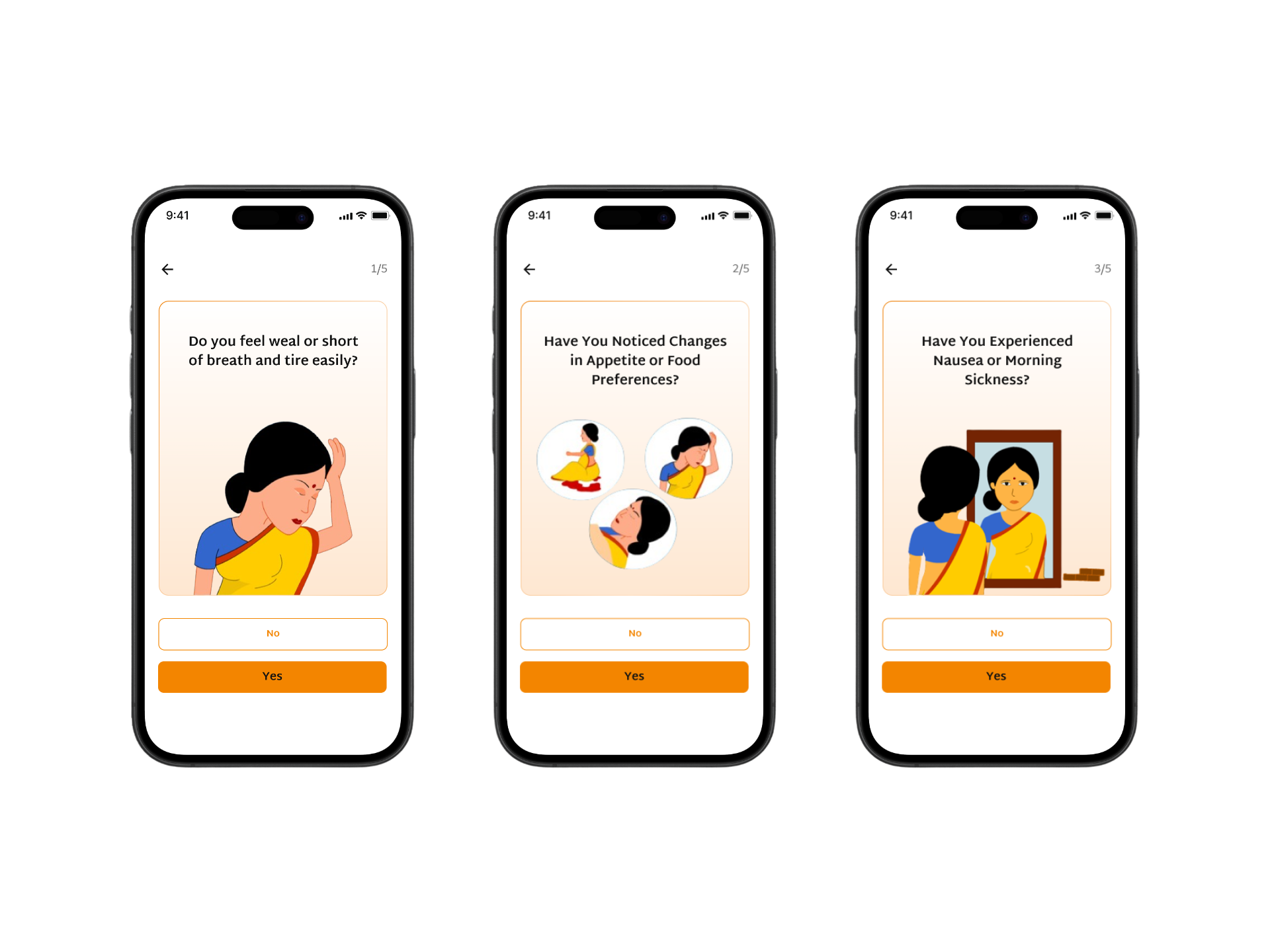
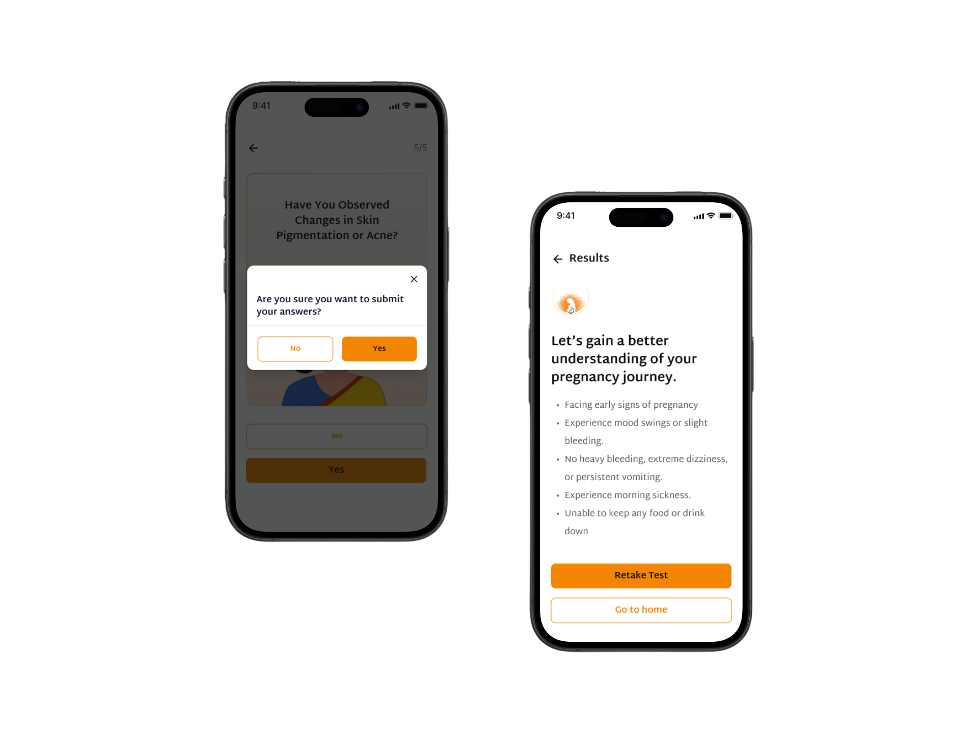
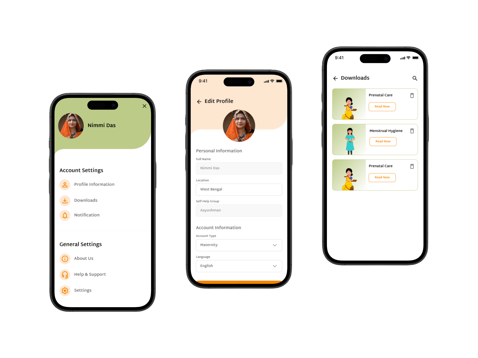
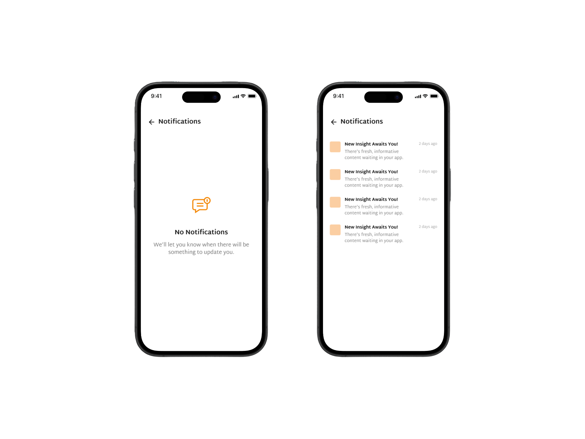
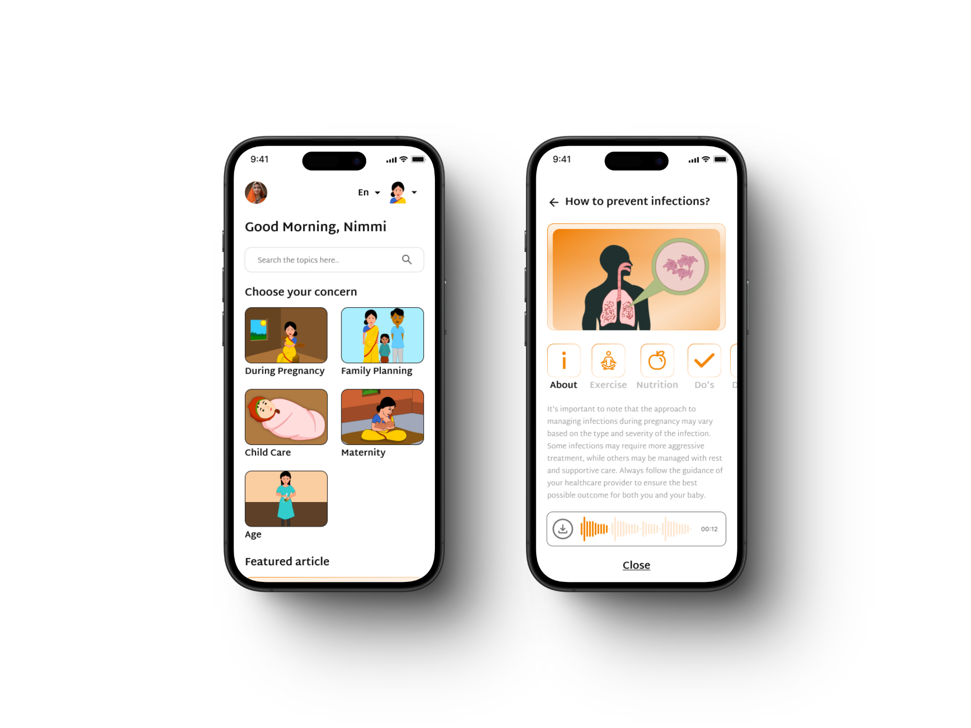
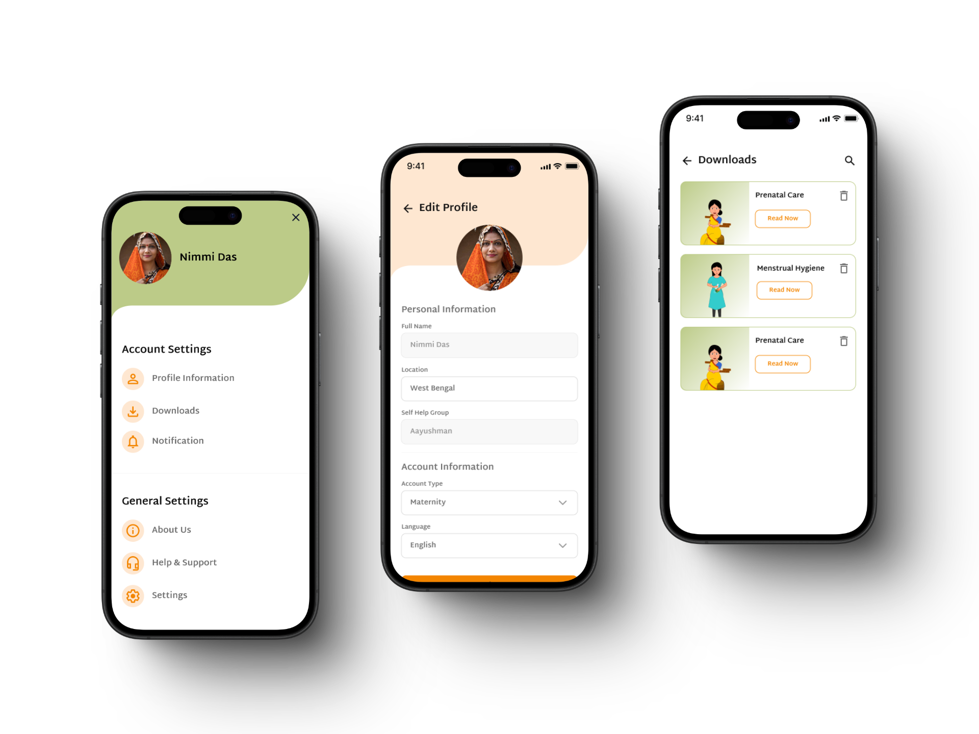
- Simplified Navigation: Organized content into clear, intuitive categories.
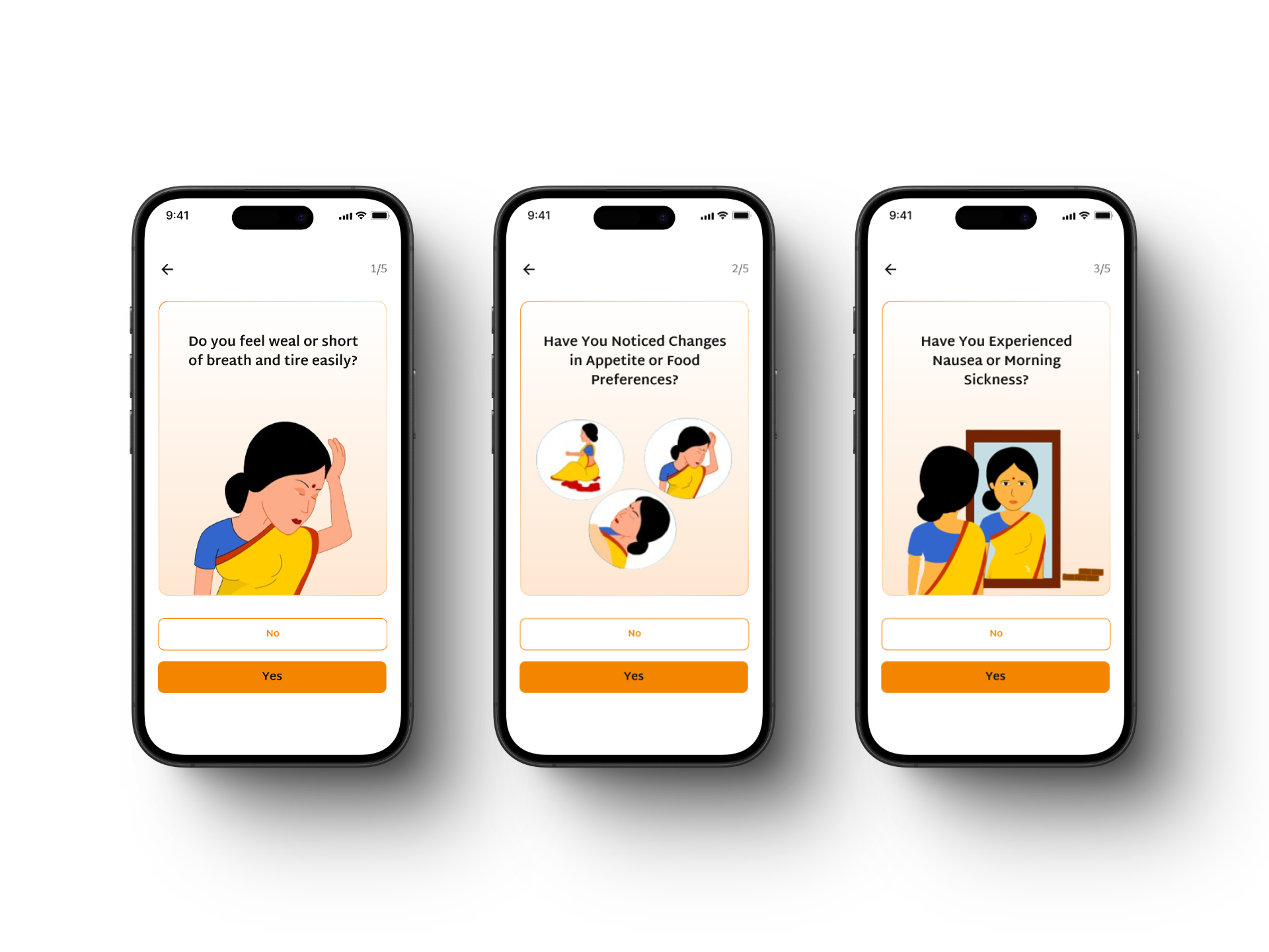
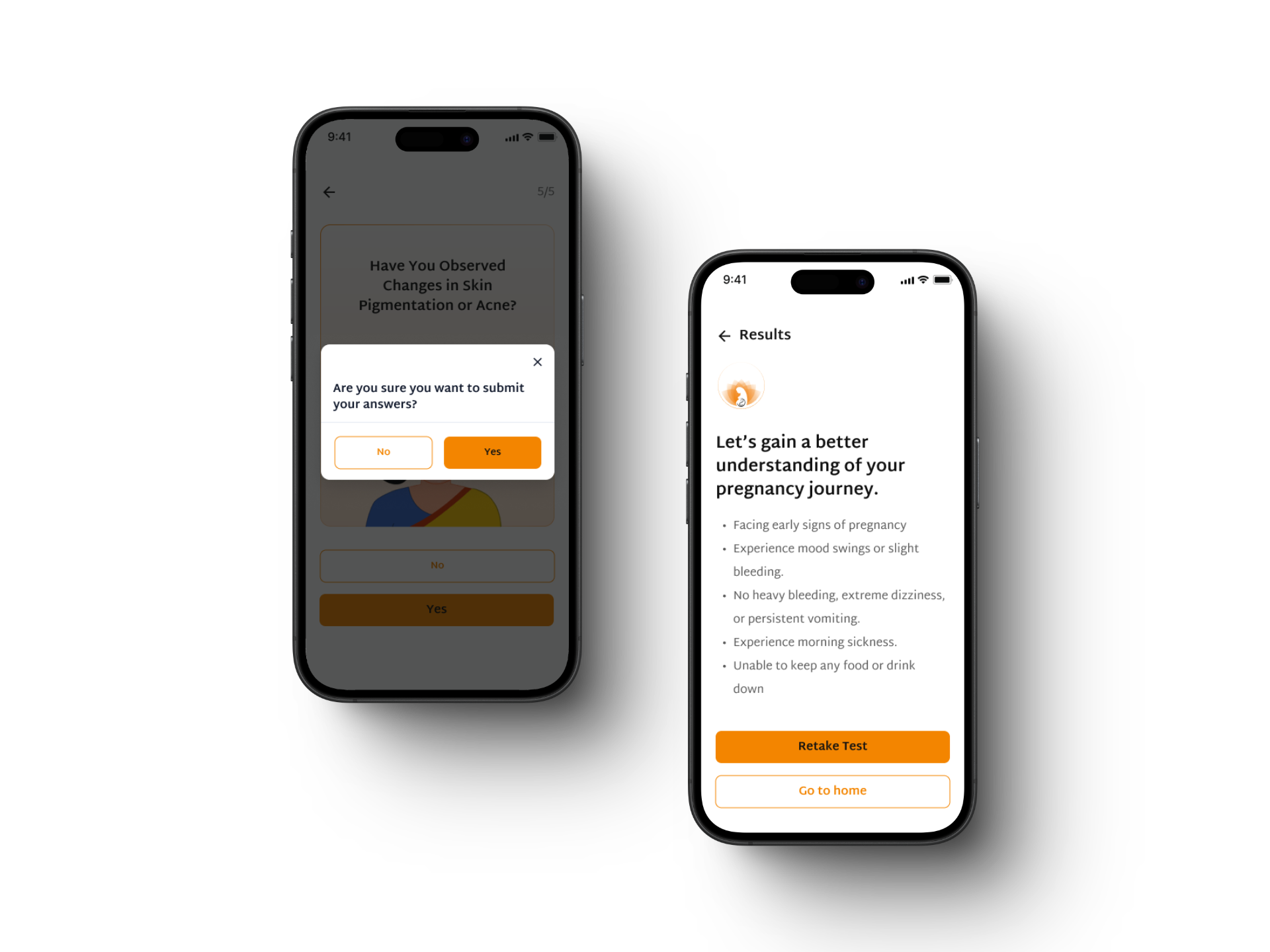
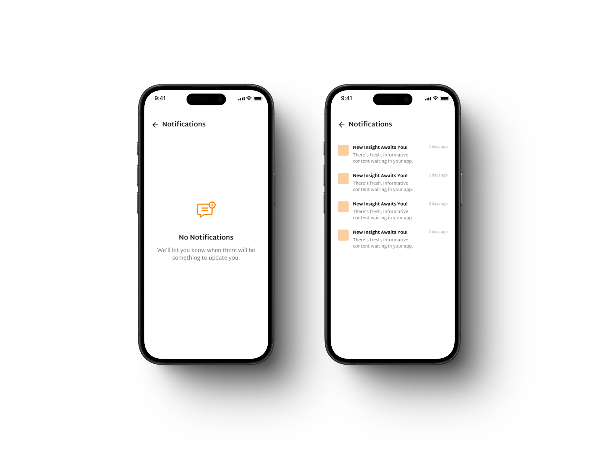
- Accessibility Improvements: High-contrast UI, large touch targets, and screen-reader support.
- Personalized Dashboard: Greet users by name and offer tailored recommendations.
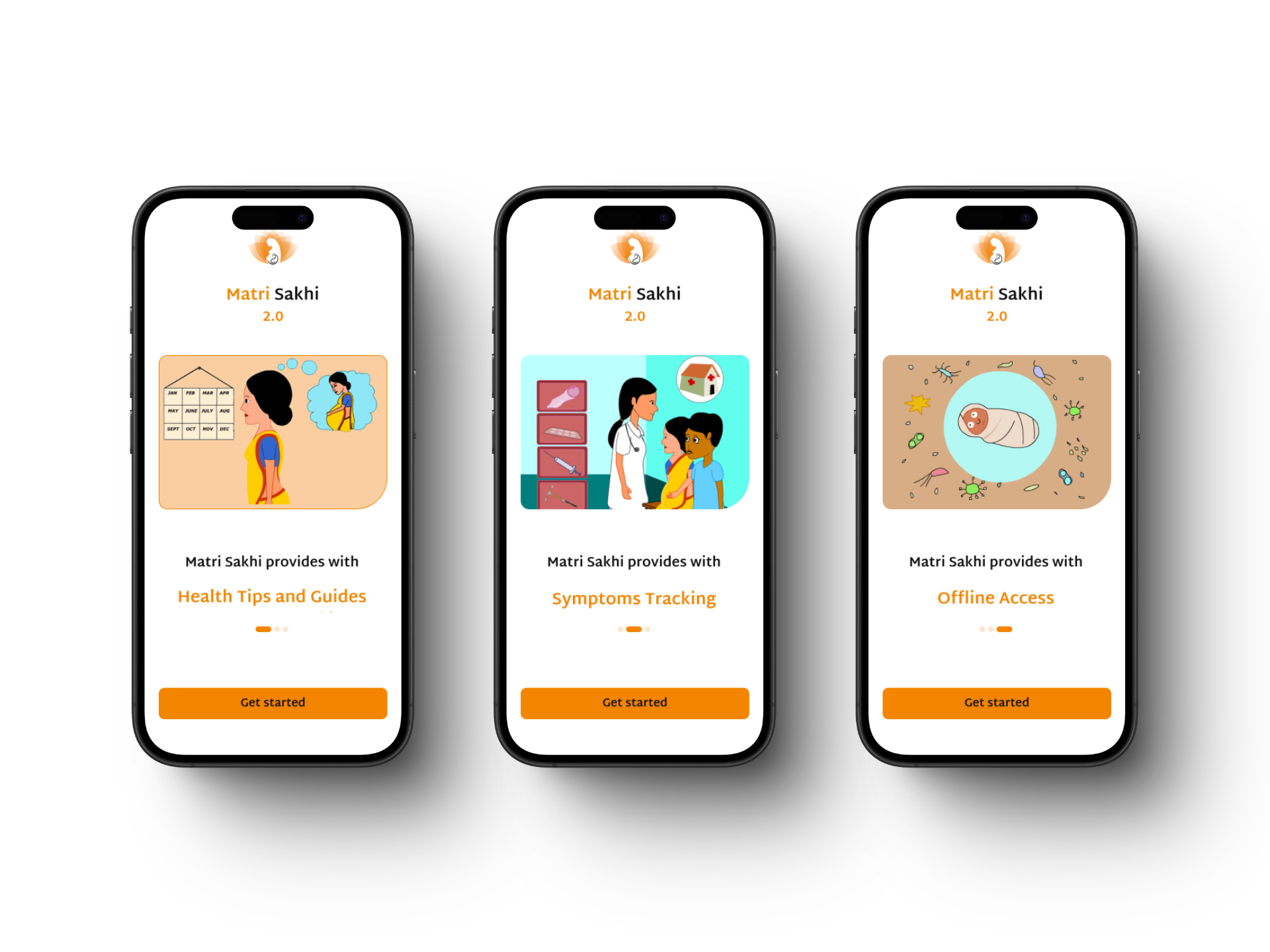
- Modernized Visual Design: Clean layouts, culturally resonant illustrations, and engaging animations.


Home
Work
About
MatriSakhi
MatriSakhi is a maternal health app designed to support expectant mothers, caregivers, and healthcare professionals. The goal was to create a user-friendly experience that simplifies access to vital health resources while ensuring inclusivity.
My role:
I led the UX/UI design for MatriSakhi, including user flows, high-fidelity screens, moodboarding, and logo design, ensuring a simple and culturally relevant experience.
Problem Statement
Complex Navigation: Users struggled to find key features.
Poor Accessibility: Limited support for visually impaired users.
Inconsistent Design: Lack of visual clarity and hierarchy.
Low Engagement: No personalization or interactive elements.
Client’s Request
Simplify the navigation for better usability.
Improve accessibility for a diverse user base.
Create a visually appealing, culturally relevant design.
Introduce personalization to boost engagement.
Solution & Key Features
- Simplified Navigation: Organized content into clear, intuitive categories.
- Accessibility Improvements: High-contrast UI, large touch targets, and screen-reader support.
- Personalized Dashboard: Greet users by name and offer tailored recommendations.
- Modernized Visual Design: Clean layouts, culturally resonant illustrations, and engaging animations.
